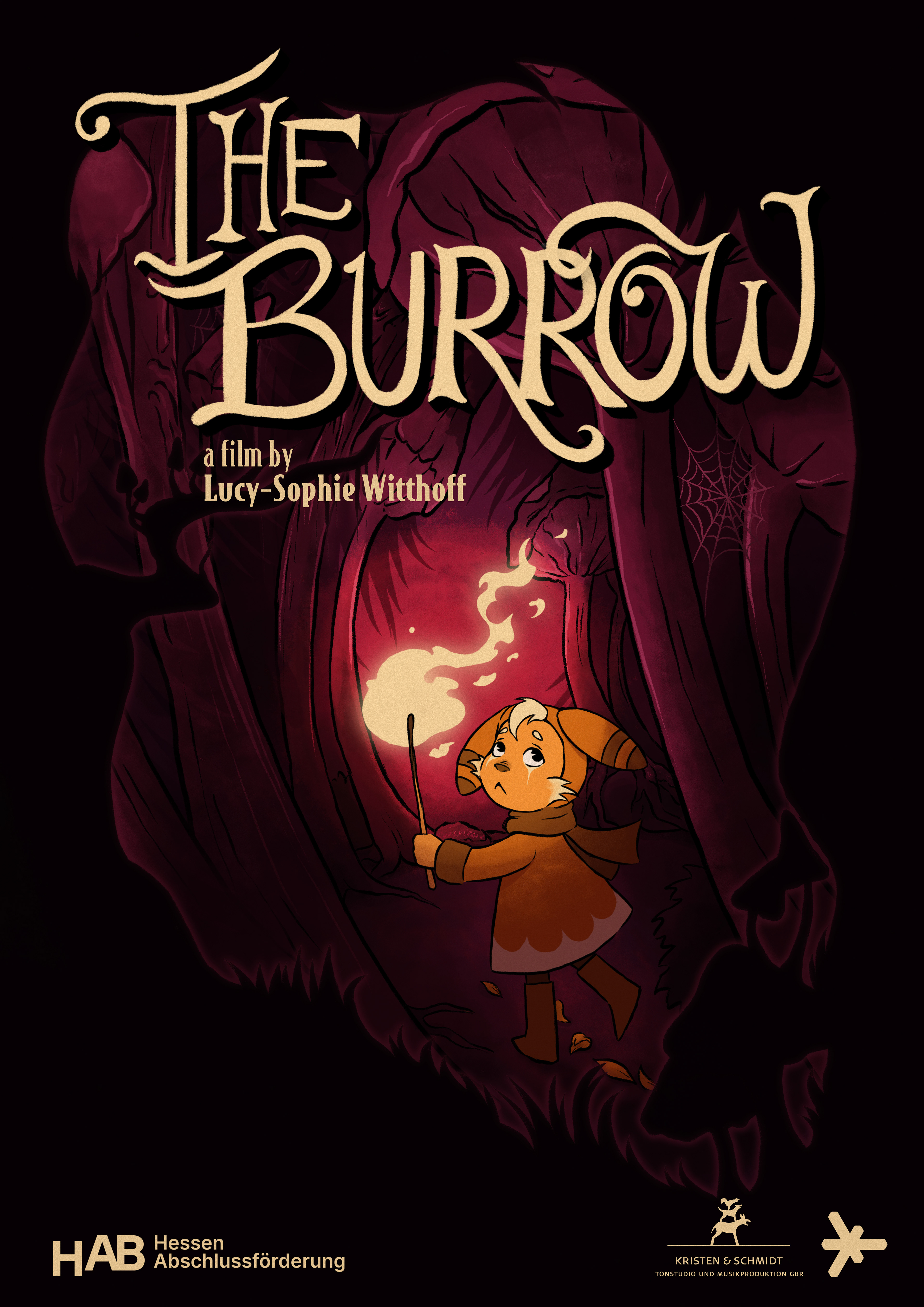

The Burrow
Year
2025
Project
Graduation film
My Disciplins
2D Animation
Cut-Out Animation
Character Design
Rigging
Background Design
Compositing
Music by
Richard Kristen
Sounddesign by
Hendrik Kristen
About
The Burrow is my graduation film and also a deeply personal project. It tells the story of a “shadow child” or “glas child”—a term used to describe siblings of children affected by mental illness and other conditions. The film explores the silent emotional burden these children often carry, shedding light on a reality too often overlooked.
In shaping the film, it was important to me to use a childlike visual style, reflecting how a child in a difficult situation might try to make sense of what happens to them. At the same time, I wanted to echo the rougher, darker tones of older animation, which I feel are often lost today. For me, it is essential that children are allowed to confront the darker sides of the world—and in doing so, perhaps feel seen.
Synopsis
When his brother disappears into the night, a young child follows him into a dark forest— embarking on a journey through pain and hope in search of the way back to the light.
Funding:


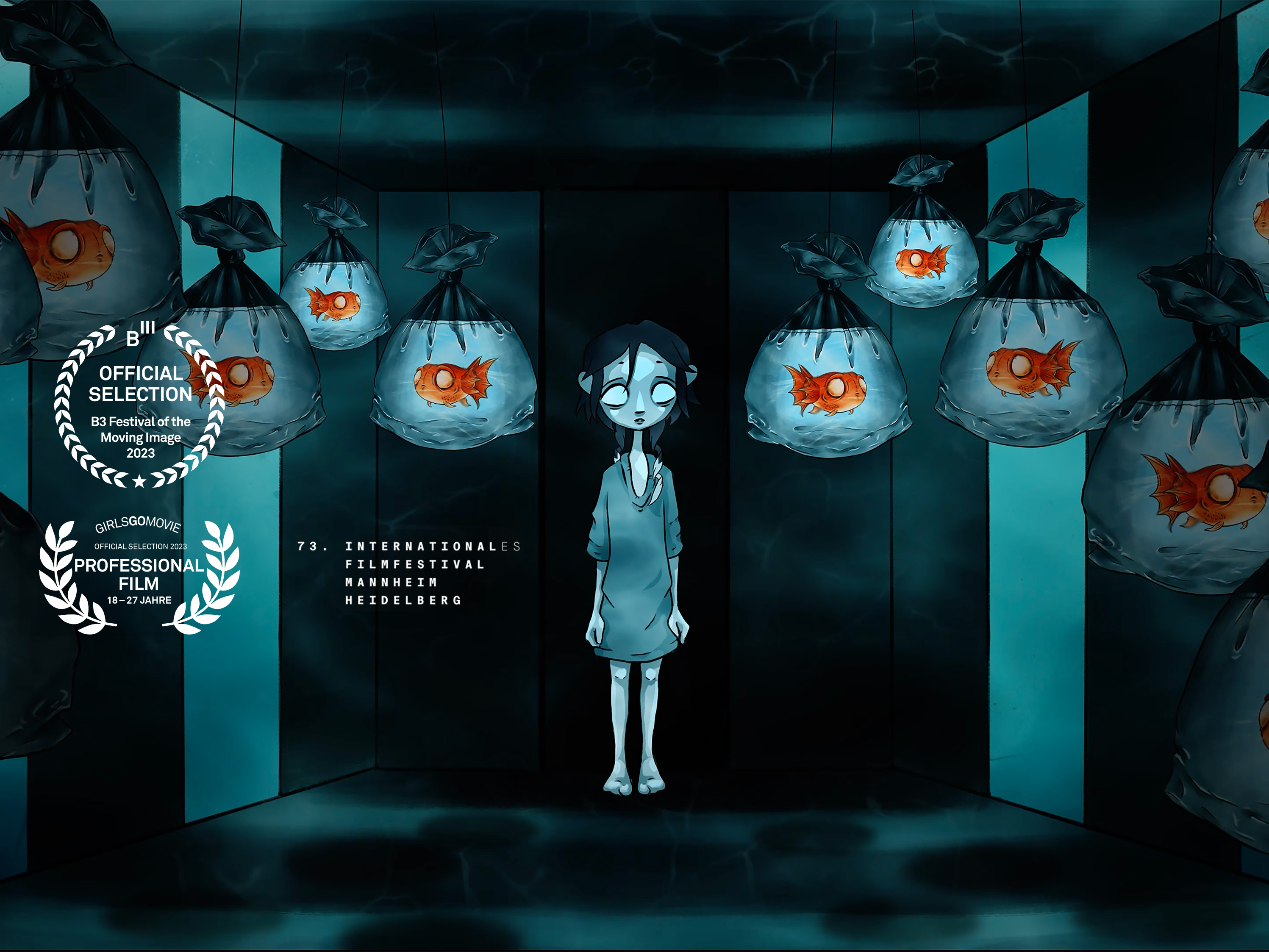
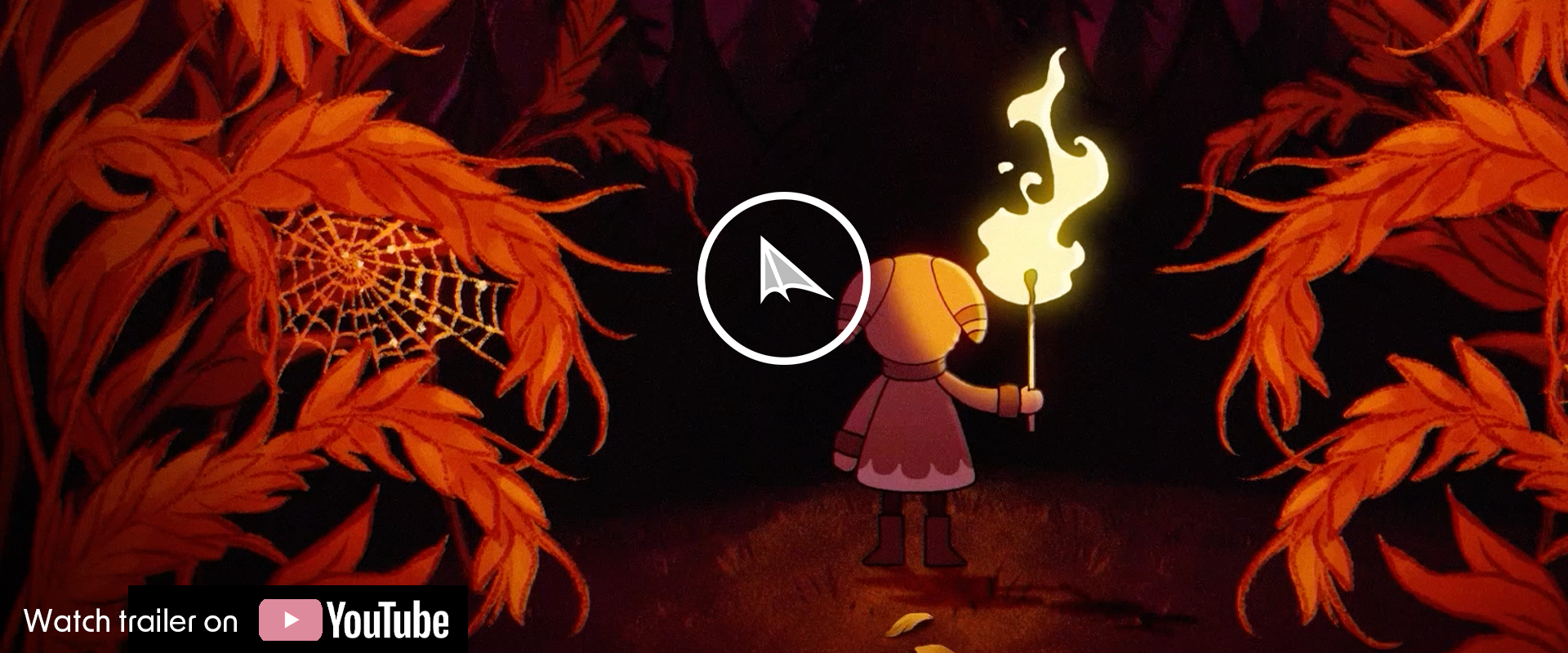
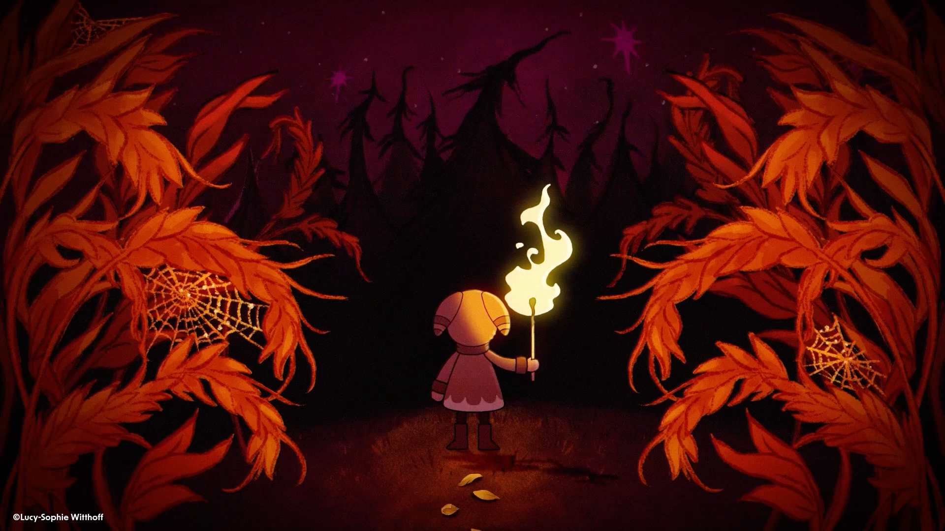
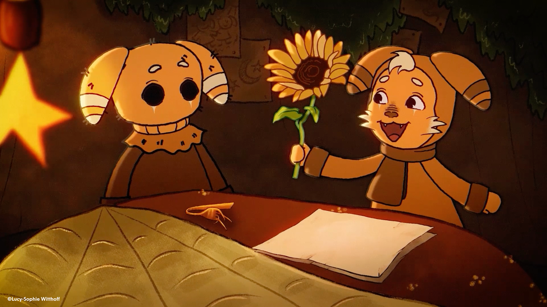
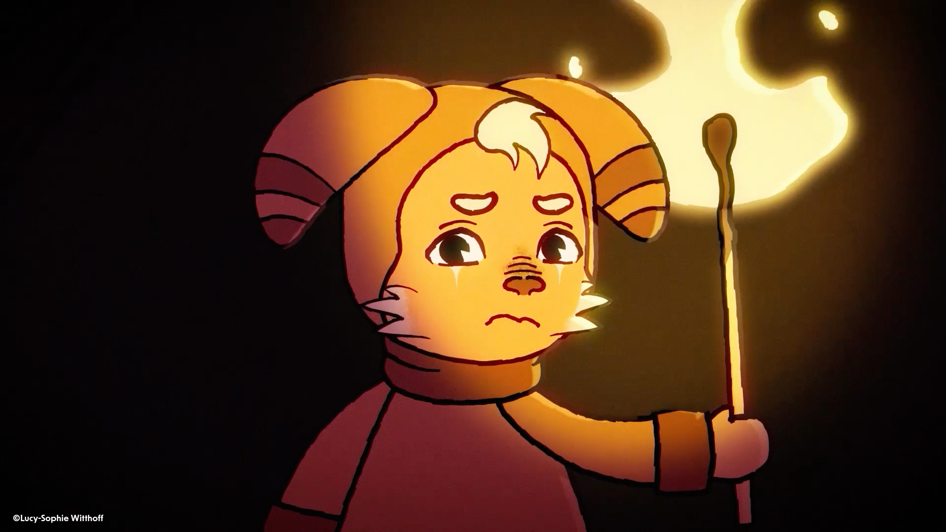
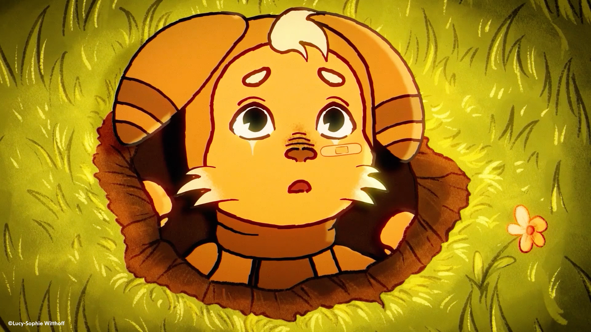
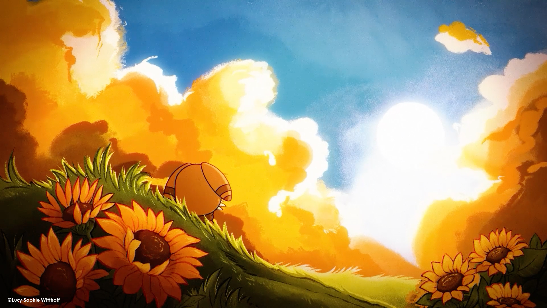
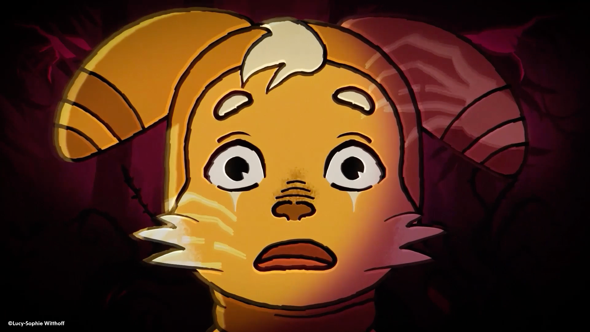
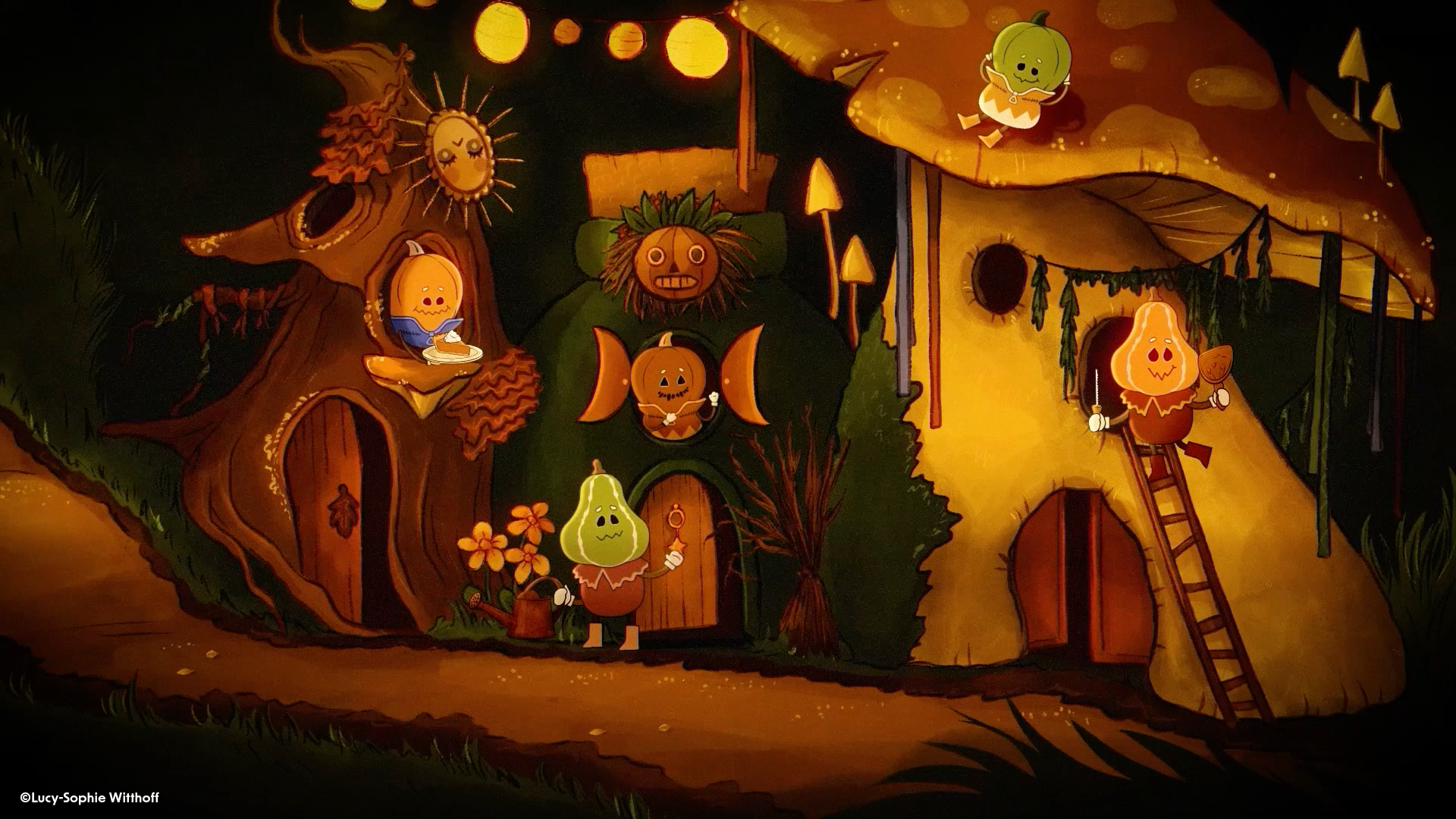
Stills
Stills from the finished film.
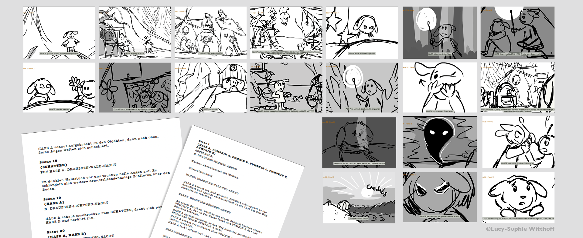
Animatic
The animatic was created in Storyboard Pro as a foundation to transfer later into Toon Boom Harmony. It helped me define timing and camera perspectives for my characters, with a strong focus on the main character. The animatic also guided the planning of backgrounds and ensured I could capture the specific angles needed for the characters.
Character Design
The idea for a character with a bunny hat has been with me for a long time. Over the years, I explored many variations—sometimes more humanoid, sometimes more animal-like, sometimes darker, sometimes cuter—before refining the final design. I chose rabbits because they are not only timid but also curious and endearing, with a strong sense of family connection.
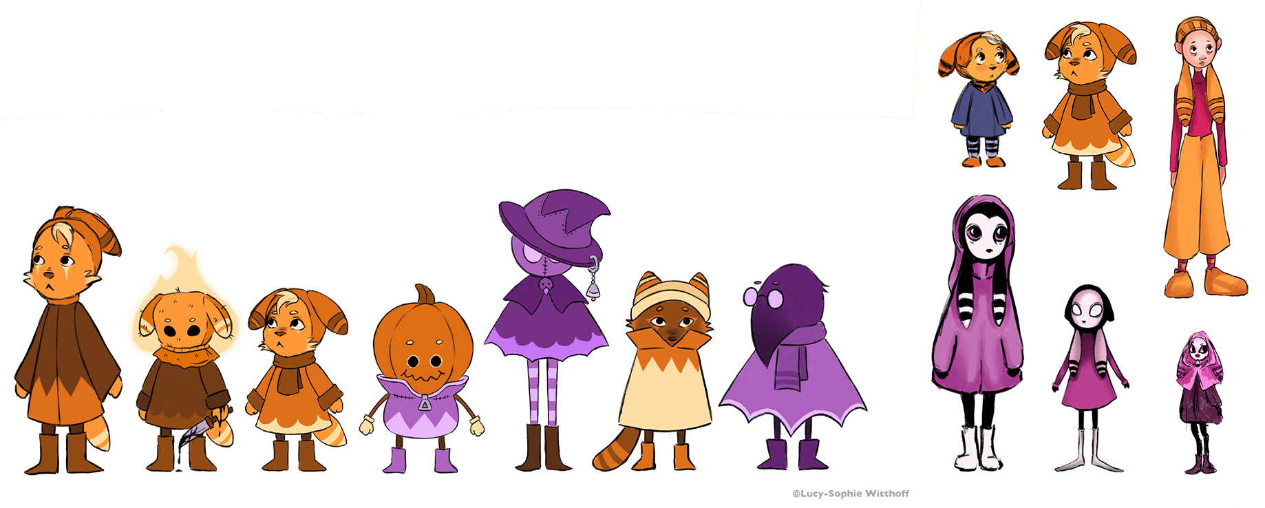
The final designs highlight the emotional core of the story.
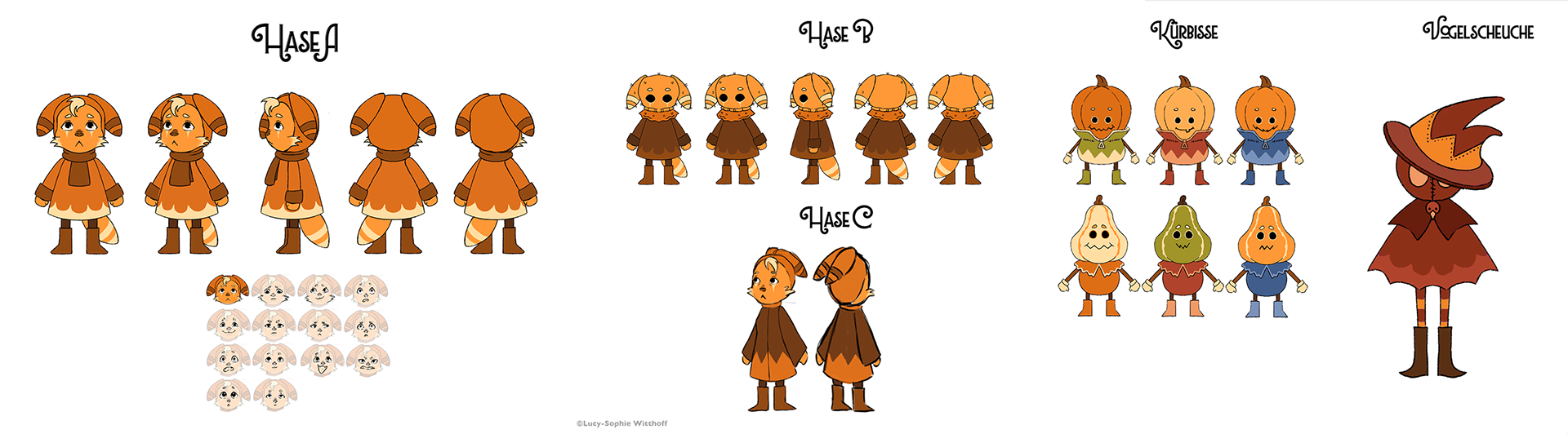
Hase A, the protagonist, is a curious yet burdened child whose earthy tones and tear-like markings reflect both innocence and responsibility. His brother, Hase B, shares similar features but with a darker, hood-like design that symbolizes hidden struggles and inner conflict. Their mother, Hase C, appears as a larger, tired but loving figure, embodying care mixed with overwhelm.
Hase A, the protagonist, is a curious yet burdened child whose earthy tones and tear-like markings reflect both innocence and responsibility. His brother, Hase B, shares similar features but with a darker, hood-like design that symbolizes hidden struggles and inner conflict. Their mother, Hase C, appears as a larger, tired but loving figure, embodying care mixed with overwhelm.
The supporting characters add contrast: the pumpkin villagers bring warmth with a slightly eerie touch, while the scarecrow represents outside authority and the painful separation of the siblings.
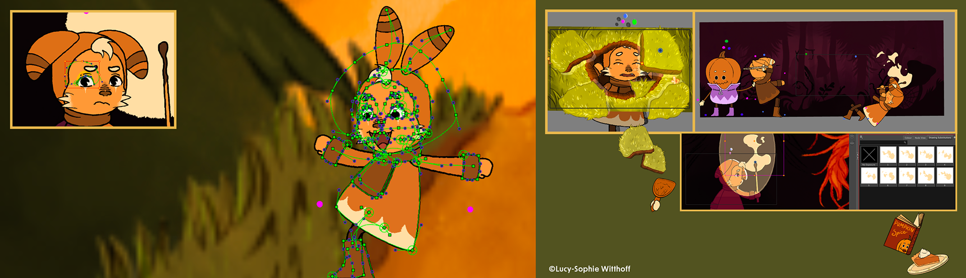
Rigging
In this video, I present the main rig of the protagonist, created in Toon Boom Harmony. This rig served as the template for all other character rigs in the film.
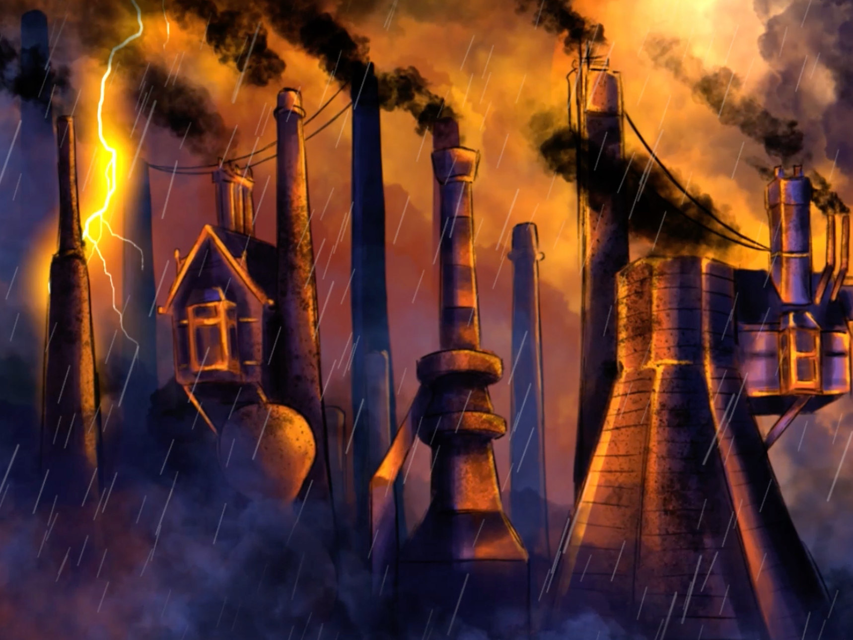
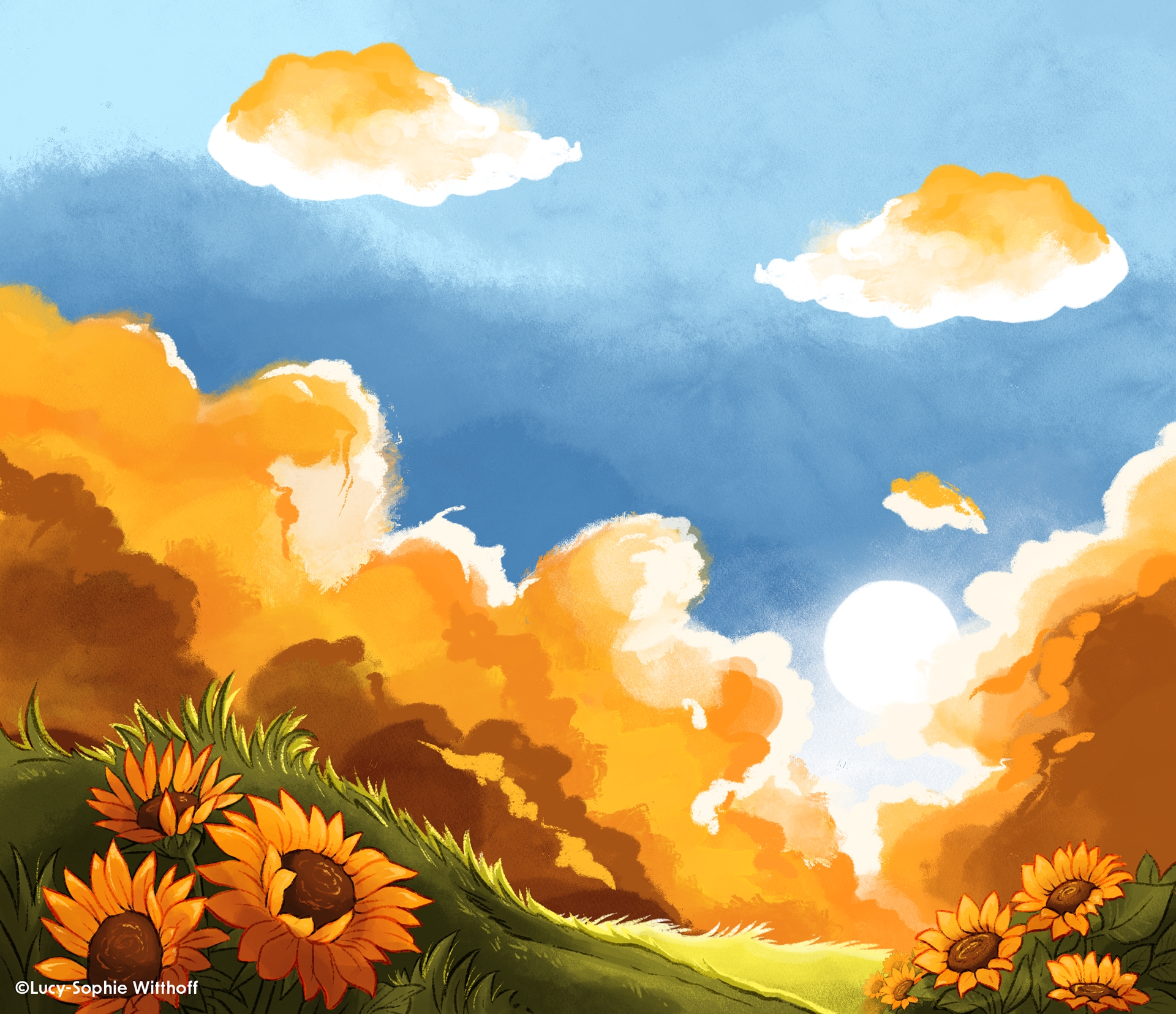
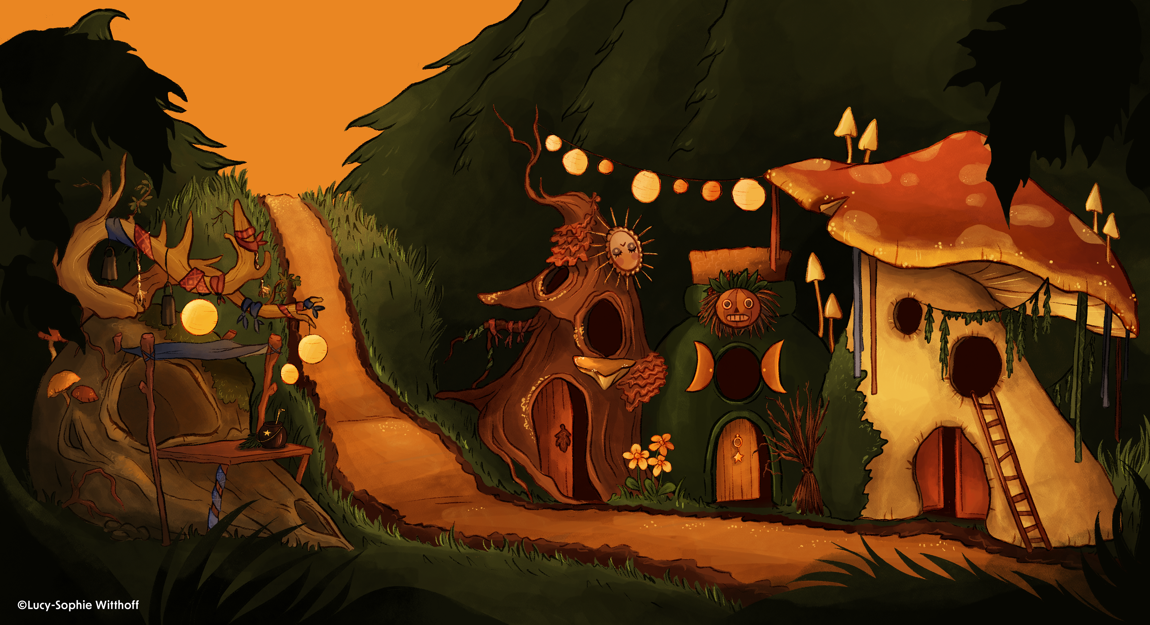
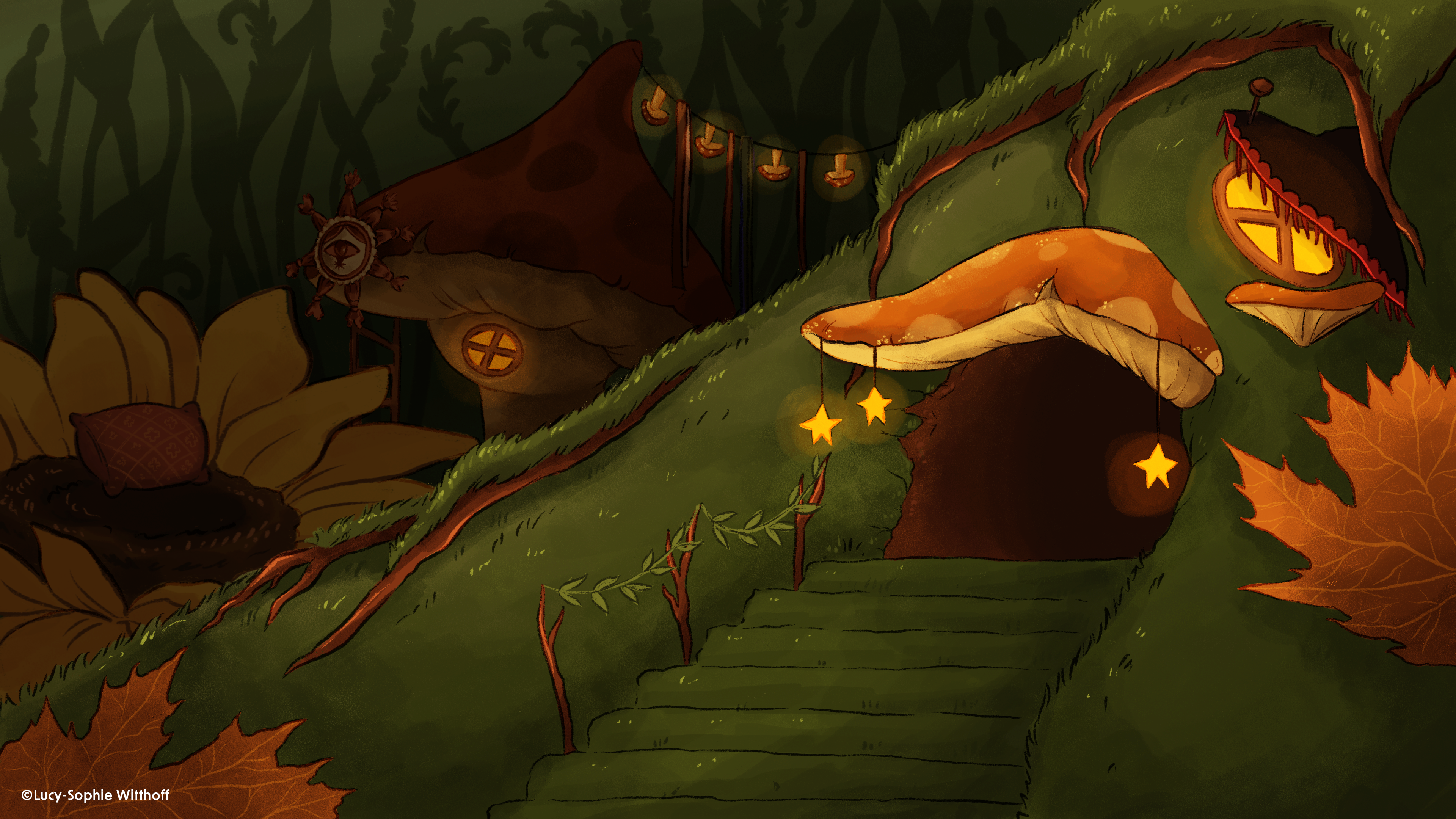
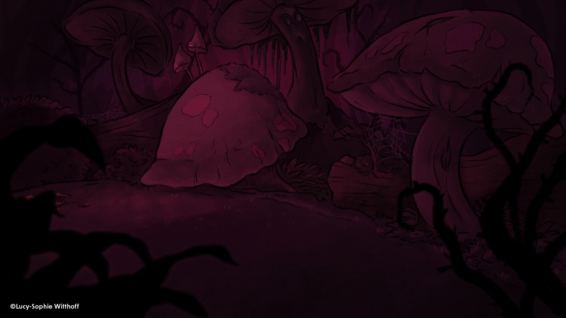
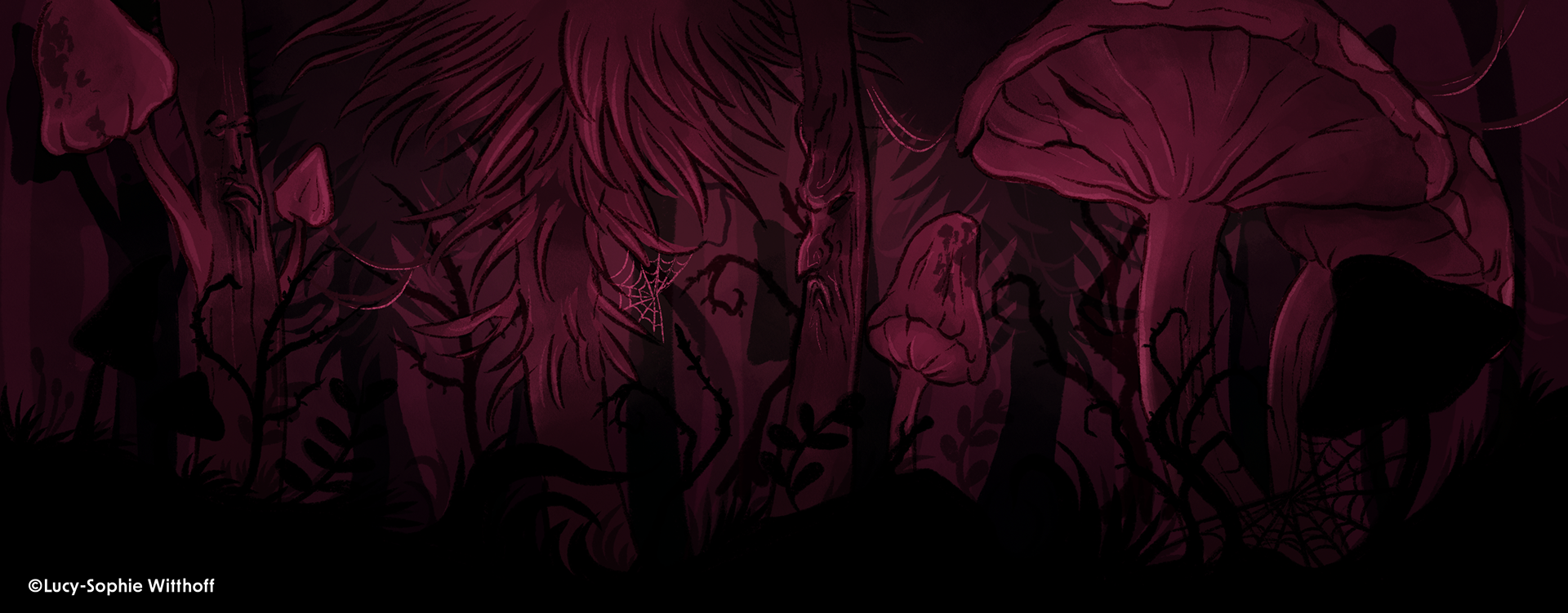
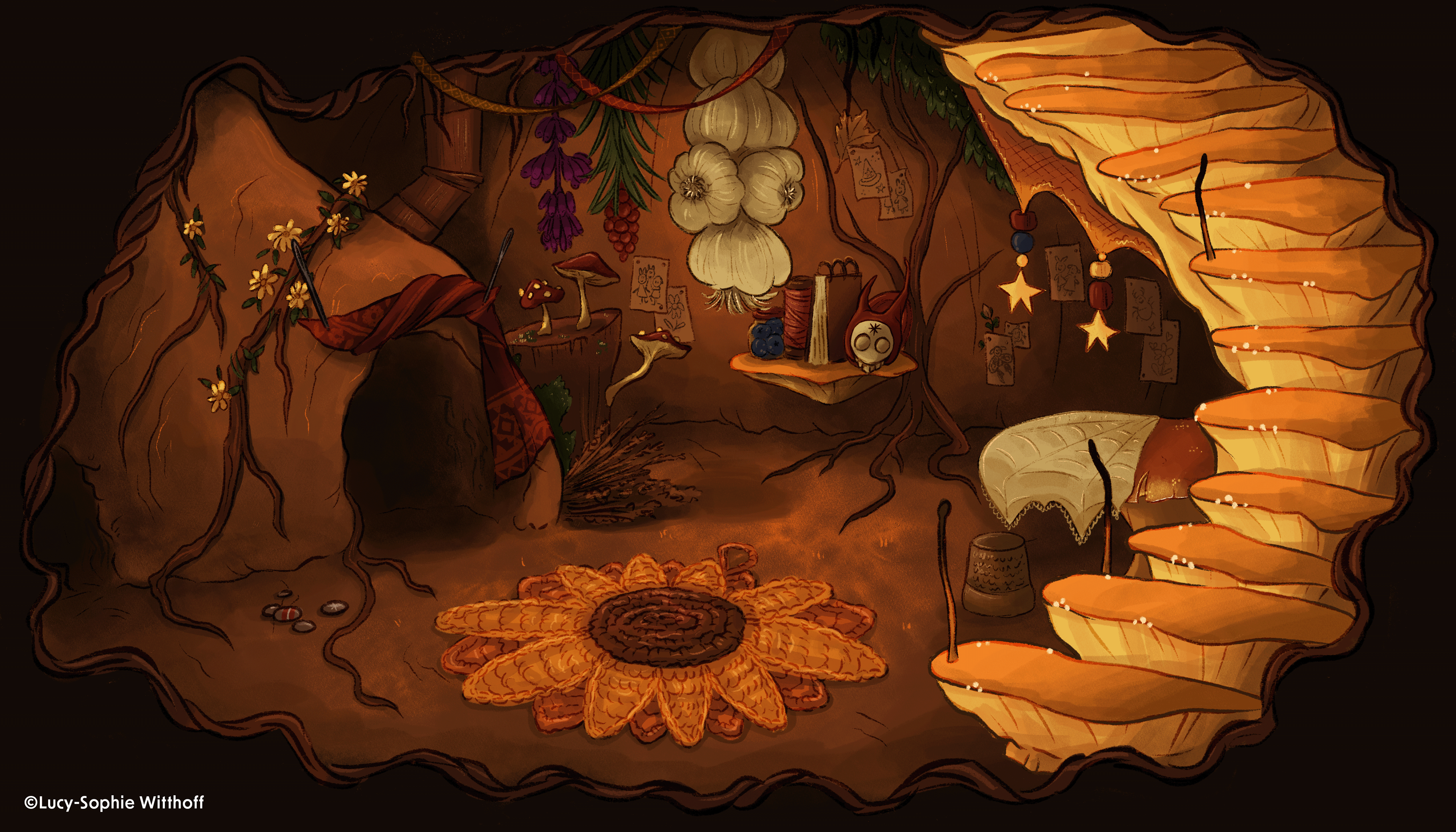
Backgrounds
In the early stages, I developed stylframes and sketches to explore atmosphere and tone. My goal was to find a balance between a cute, childlike aesthetic and darker, rougher accents. This process helped me shape environments that feel both inviting and unsettling at the same time.
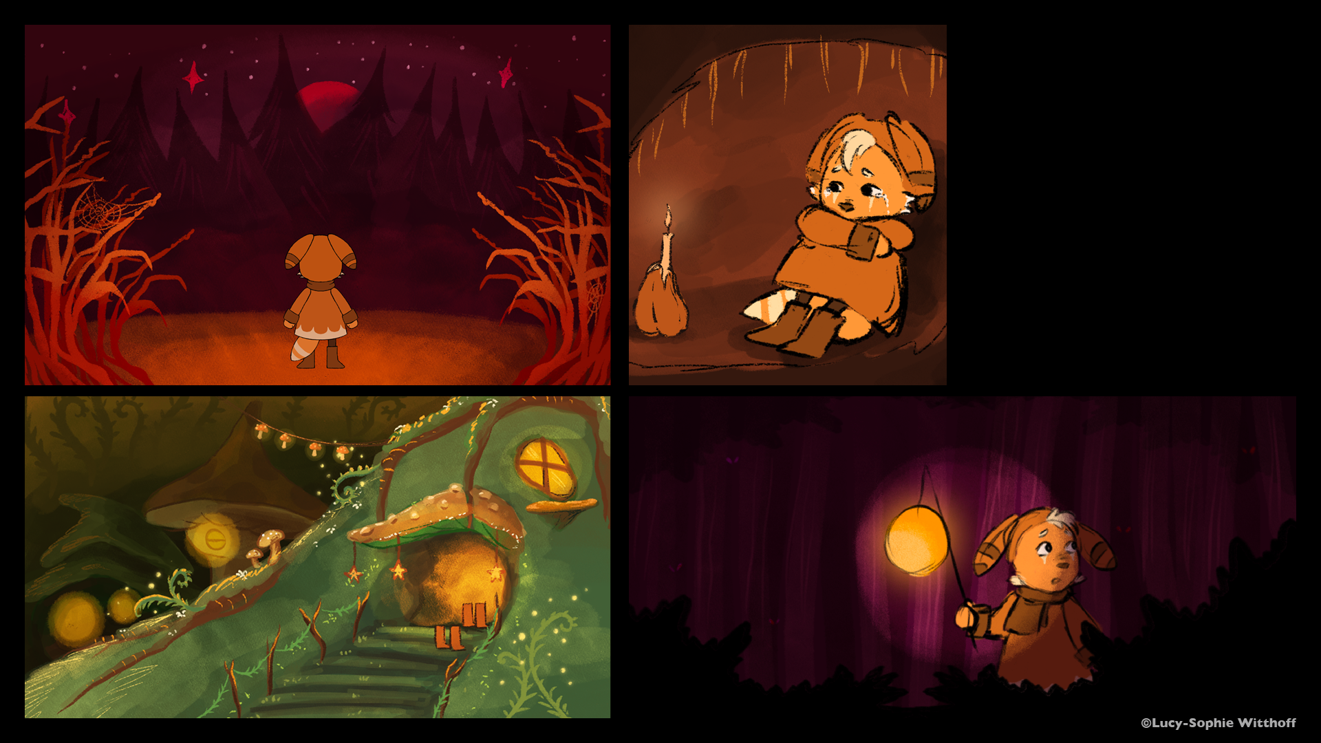
The finished backgrounds combine fairytale charm with darker, threatening undertones. Rich in detail, they shift from warm, saturated colors by day to eerie purples and unnatural tones by night. Recurring elements like masks and sunflowers provide environmental storytelling—symbols of hidden truths, observation, and resilience. Many small details are woven into the scenes, from matchsticks to grapes, adding layers of meaning while supporting the emotional journey of the characters.
Animation
For the characters, I chose cut-out animation, complemented by frame-by-frame elements. This combination allowed me to stay close to my influences from traditional animated films while adding a handcrafted quality to the project.
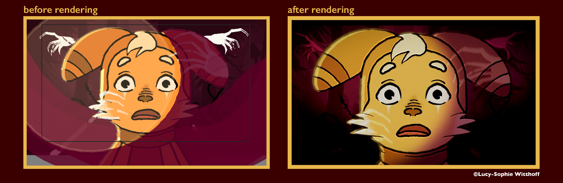
Compositing
The compositing process involved a lot of testing to find the right look. I experimented with light, shadows, and gradients to ground the characters in the scene. Additional effects like rain, color correction, and grain were refined in After Effects to give the film its final atmosphere.
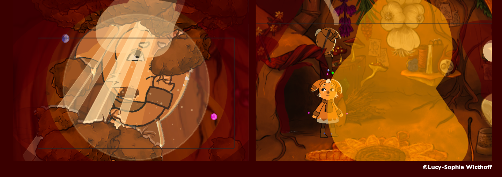
Example of the before and after rendering:
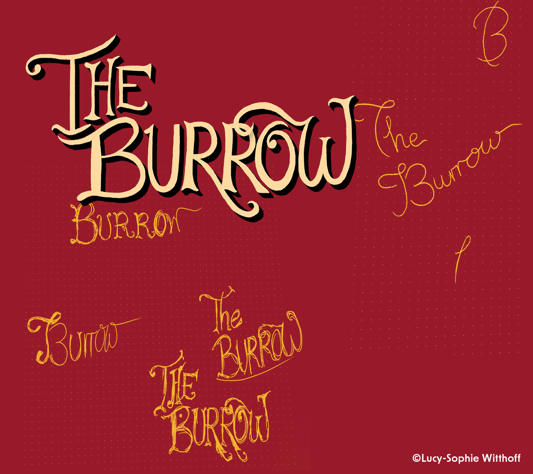
Title Design
The working title was "Rabbit Hole", but it was changed to "The Burrow" to include a wider range of animals, reflecting the protagonist’s less rabbit-like appearance at the end. The title design features a nostalgic, ornate typeface inspired by old title cards, creating a strong visual statement at the start of the film.
Filmposter
The Filmposter I designed for "The Burrow"